Getting started with t-SNE for biologist (R)
March 29, 2019
Hi everyone 🙋♂️ With the dramatic increase in the generation of high-dimensional data (single-cell sequencing, RNA-Seq, CyToF, etc..) in biology, the need for visualizing them in a meaningful way has become increasingly important. Also if you are a pure experimental biologist with little or no coding experience, it can sometimes get quiet bothersome to consistently depend on a bio-informatician for generating these plots for your data. To be honest, several packages (think of it as software) are now available within R or Python that has made this process extremely simple.
Like how you would click buttons within a software UI, these packages would require some basic information from you- like where is your data located? which column of your data represents the sample name? etc.. and it does the rest of the job for you.
I am writing this tutorial assuming that you have no coding experience and know what a t_SNE plot is. By the end of this tutorial you would have setup R, installed packages within R, generated t-SNE plot of a dummy dataset and finally generated a t-SNE plot of your own data.
Let’s get started!
Step-1: Install R and R studio
- Go to the CRAN website and download the latest version of R for your machine (Linux, Mac or Windows). If you are using windows, the easiest setup process would be to click on the ‘base’ link and if you are using Mac click on the R-3.x.x.pkg link. Once it is downloaded, you install it like any other software.
- Now download R Studio. Although this is not necessary, this software will make your coding life in R much more enjoyable and easy.
There is no shortage for resources in setting up R and R studio. I am going to link you to a youtube video for you to watch if you get stuck in one of the above two steps. It also highlights many of RStudio’s capabilities over just having R on your system.
Step-2: Install the necessary packages within R to generate a t-SNE plot
There are several packages that have implemented t-SNE. For today we are going to install a package called Rtsne. To do this- type the following within the console area of your RStudio. It might ask you to choose a server to download the package- I generally choose the one that is closest to me.
install.packages("Rtsne")
Step-3: Generate a t-SNE plot with dummy data
An interesting fact about R is that it comes with a number of inbuilt datasets. You can view them by typing ‘data()’ into your console. For today we are going to use one of those datasets to build a t-SNE plot. The dataset that we are going to use is called ‘IRIS’
The iris dataset contains four measurements (Sepal Length, Sepal Width, Petal Length, Petal Width) for 150 flowers representing three species (Iris setosa, versicolor and virginica) of IRIS. You can take a look at the data yourself by typing ‘iris’ into your console. Below is the expected output.
> iris
    Sepal.Length Sepal.Width Petal.Length Petal.Width    Species
            5.1         3.5          1.4         0.2     setosa
            4.9         3.0          1.4         0.2     setosa
            4.7         3.2          1.3         0.2     setosa
            4.6         3.1          1.5         0.2     setosa
            5.0         3.6          1.4         0.2     setosa
            5.4         3.9          1.7         0.4     setosa
            4.6         3.4          1.4         0.3     setosa
            5.0         3.4          1.5         0.2     setosa
Let’s run the t-SNE algorithm on this dataset and generate a t-SNE plot.
First load the dataset into the console (IR) and split it into two groups (in R we call it objects). The first object (IR_data) will contain the four measurements for all 150 flower and the second object (IR_species) will contain the species information. After which we load the t-SNE library, run the algorithm and plot the results as shown below.
## Learning t-SNE Plotting
## Load dataset
IR <- iris # Loading the iris dataset into a object called IR

## Split IR into two objects: 1) containing measurements 2) containing species type
IR_data <- IR[ ,1:4] # We are sub-setting IR object such as to include 'all rows' and columns 1 to 4.
IR_species <- IR[ ,5] # We are sub-setting IR object such as to include 'all rows' and column 5.

## Load the t-SNE library
library(Rtsne)

## Run the t-SNE algorithm and store the results into an object called tsne_results
tsne_results <- Rtsne(IR_data, perplexity=30, check_duplicates = FALSE) # You can change the value of perplexity and see how the plot changes

## Generate the t_SNE plot
par(mfrow=c(1,2)) # To plot two images side-by-side
plot(tsne_results$Y, col = "blue", pch = 19, cex = 1.5) # Plotting the first image
plot(tsne_results$Y, col = "black", bg= IR_species, pch = 21, cex = 1.5) # Second plot: Color the plot by the real species type (bg= IR_species)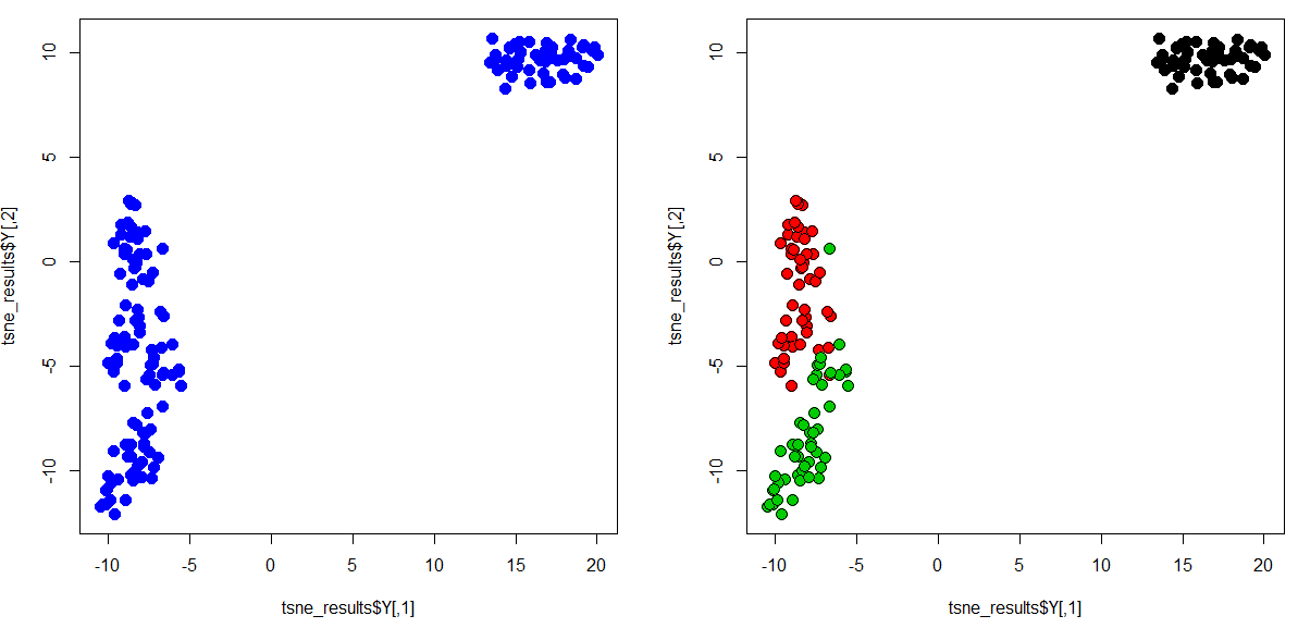
That is it. You have successfully generated your first t-SNE plot. Congratulations! As you can see from the plot above, the algorithm has grouped the flowers of the same species together based on the four features.
Step-4: Now lets try building a t_SNE plot with our own data
If you think about it, the first object (IR_data) in the previous example broadly represents the kind of data you would be having (RNASeq or single-cell sequencing data). In which case you will have genes in columns and samples in rows. It may look something like this.
> your_data
                   Gene_1      Gene_2       Gene_3      Gene_4
Sample_1            5.1         3.5          1.4         0.2
Sample_2            4.9         3.0          1.4         0.2
Sample_3            4.7         3.2          1.3         0.2
Sample_4            4.6         3.1          1.5         0.2
Sample_5            5.0         3.6          1.4         0.2
I have an example single-cell RNASeq data for you.
- Expression file can be found here.
- The cell-type annotation or meta-data can be found here.
I have already pre-processed the data, performed a clustering analysis and identified the cell types (provided them in the meta file) based on the genes they express. Go through these two files and familiarize yourself with the their formatting.
Expression file: This file should contain cells in rows and genes in columns. All rows (cells) should have a ‘unique’ cell name and all columns (genes) should also have a ‘unique’ gene name.
The meta-data file: should contain the same row names/ cell names and a column containing the cell-type. This file is only necessary if you would like to color your t-SNE plot based on cell-type.
Open your data in excel and format it similar to the one I have provided (save as .CSV). Once you are ready, we can go ahead and generate a t-SNE plot of your own data.
I have saved both of files in a folder called ‘tsne_tutorial’ on my desktop. So the first step is to tell R, where your files are located. We call this working directory in R.
## Set working directory
setwd("C:/Users/ajn16/Desktop/tsne_tutorial")
Once the directory is set, R would know where look for your files. Now let’s load your data.
## Set working directory
expression_data <- read.table(file = "exp.csv", row.names = 1, sep=',', header = T) # This command looks for a file named 'exp.csv' within your working directory and would set the first column as row names/ cell names and the first row as column names/ gene names.
meta_data <- read.table(file = "meta.csv", row.names = 1, sep=',', header = T)
Now we are good to go. Lets run the t_SNE algorithm and generate a plot as we did previously.
If you get any error at this point, it probably because your data is not in the right-format. Go back and check if they are okay.
## Run the t-SNE algorithm and store the results into an object called tsne_results
tsne_realData <- Rtsne(expression_data, perplexity=10, check_duplicates = FALSE)
The above step may take a while depending on the size of your dataset. There are quicker options like UMAP which is also slightly better in other ways in maintaining the global architecture of the clusters. If you would like to learn that, let me know in the comments.
Okay we are now ready for the final step!
## Generate the t_SNE plot
par(mfrow=c(1,2))
plot(tsne_realData$Y, col = "blue", pch = 19, cex = 1)
plot(tsne_realData$Y, col = "black", bg= meta_data$louvain, pch = 21, cex = 1)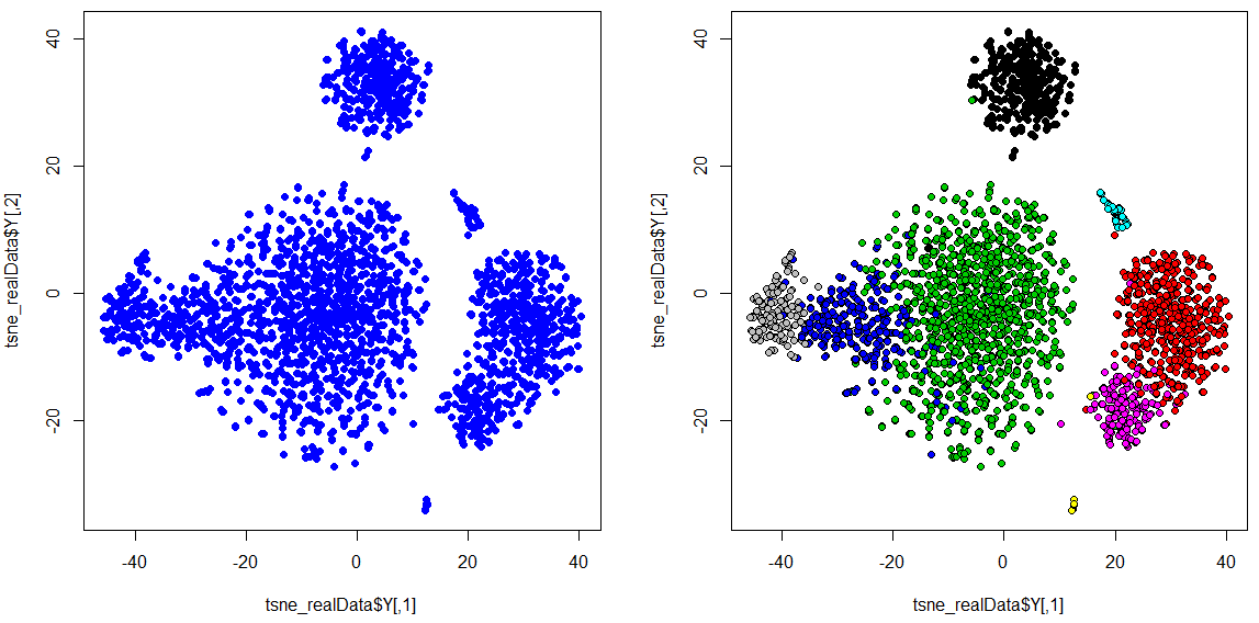
There we have it. In this case,
- Green is CD4 T cells
- Blue is CD8 T cells
- Grey is NK cells
- Red is CD14 + Monocytes
- Magenta is FCGR3A+ Monocytes
- Black is B cells
- Cyan is Dendritic cells
- Yellow is Megakaryocytes
Hope you successfully generated your own t-SNE plot. If you have an questions or found any particular step difficult to follow, please do let me know in the comments. You might eventually google and figure it out, however, if it took you a while to do so, probably someone else is facing a similar situation as well. So please do let me know and I will update the article to make it more enjoyable for every one.
PS- If you have single-cell RNASeq data, I would recommend using some single-cell specific packages such as seurat in R or ScanPy in python to do your analysis. They include everything from data-processing, clustering and generating plots such as these within them. It will make your life a lot easier.
Bye for now! Have a nice day 😊